Logo Logo en
  • iRidi Pro
    Основные компоненты
    • Приложение i3 Pro
    • iRidi Pro Server
    • iRidi Studio
    • iRidium studio v. 1.3.8 (устаревшая версия)
    Java Script в iRidi
    • Руководство
    • Справочник
    • Примеры
    • JS драйвера
    другие
    • Личный Кабинет
    • iRidium Cloud
    • iRidium Transfer
    • Push-уведомления
    • Лучшая практика
    Лицензирование
    • Лицензирование и передача проекта
    • Оффлайн-лицензирование
    • Активация iRidi Pro Server
  • Продукты
    i3 lite
    • Приложение i3 lite
    • Регистрация и лицензирование
    • Сервер
    • Модули
    KNX Home Server
    • Приложение i3 KNX
    • KNX Home Server
    BUS77 HOME SERVER
    • Приложения Bus77 Home и Bus77 Lite
    • Bus77 Home Server
    Решения
    • BYOD - решение для гостиниц
    • Портал жителя - решение для МКД
    iRidi SCADA
    • iRidi SCADA
  • Bus77
    НАСТРОЙКА BUS77
    • Основы Bus77
    • Приложения Bus77 Home и Bus77 Lite
    • Работа с драйвером Bus77 в iRidi Studio
    • Настройка шины Bus77 в iRidi Studio
    ПРОТОКОЛ BUS77
    • Характеристики CAN (Bus77)
    • Описание протокола
    • Исходники на GitHub
    ОБОРУДОВАНИЕ BUS77
    • Каталог Bus77 Pro
    • Каталог Bus77 Lite
  • Поддерживаемое оборудование
    Драйверы
    • Список драйверов
    • ProAV драйвера
    • AV & Custom Systems
    • JS драйвера
    • Сторонние драйвера и фриланс
    Протоколы и интерфейсы
    • Голосовое управление
    • 1-Wire
    • BACnet IP
    • Bus77
    • KNX
    • KNX IP BAOS
    • Weinzierl kBerry
    • Microsoft Exchange
    • Modbus
    • MQTT
    • NFC
    • ODBC
    • Onvif
    • SIP
    • SNMP
    • Wake On Lan
    • Z-Wave
    • ZigBee
    Производители
    • AMX
    • AVCiT
    • Beckhoff ADS
    • Biamp Tesira
    • Bluesound
    • Casambi
    • BSS Harman
    • Clipsal
    • ControlArt 7Port
    • Crestron
    • DigiBird
    • Domintell
    • Duotecno
    • EIDE
    • EPSNET
    • Global Cache
    • HDL Buspro
    • Helvar
    • IEAST
    • INELS BUS
    • INELS Wireless
    • Intesis
    • Kleger
    • Kramer VIA
    • Kramer 3000
    • Larnitech
    • Legrand Netatmo
    • LG TV
    • Lutron
    • Lutron Homeworks QS
    • MyHome
    • Nest
    • Novastar
    • Panasоnic PTZ
    • Philips Dynalite
    • PJLink
    • Satel
    • SamsungTV
    • Sonos
    • Somfy
    • SpinetiX
    • Televic Conference
    • TIS
    • Tion
    • URRI
    • Velbus
    • Velocio
    • Vinteo
    • WyreStorm
    • WiiM
    • Xicato
    • Yamaha
    • ZONT
    • Z-Wave.me
    Протестированное оборудование
    • Панель HDL S57
    • Панель HDL S10
    • SIP-домофон
    • Akuvox
    • Arlight
    • Divus
    • QBic TD-1050 PRO
    • QBic TD-1060 Slim
    • QBic TD-1070
    • Sigur
    • Uni-Ubi
    • Velocio
  • Оборудование iRidi

    Серверы
    • HS Сервер
    • ProAV Control Processor Basic
    • ProAV Control Processor Advanced
    • Спецификация контроллеров UMC
    • Настройка контроллера UMC C2
    • Настройка контроллера UMC C3
    • Настройка контроллера HDL IntelliCenter 2 (UMC C4)
    Модули расширения
    • I-PX-RS1
    • I-PX-RS4
    • I-PX-IR3
    KNX
    • KNX Home Server
    • KNX IP Interface
    Панели управления
    • iRidium Panel 7
    • Touch Panel P3
    • Touch Panel P6
    • Touch Panel P8
    • Touch Panel P10
    • Tabletop Touch Panel 10
    • AV Remote Control
    ОБОРУДОВАНИЕ BUS77
    • Каталог Bus77 Pro
    • Каталог Bus77 Lite
    • Differences
iRidium mobile web-site
Содержание
    Инструменты‌
    • Сведения о странице
    • Постоянная ссылка
    • Версия для печати
    • Спецстраницы
    • Связанные правки
    • Ссылки сюда
    Login / Create Account
    Материал из for iRidium developers
    Перейти к: навигация, поиск
    Эта страница является переводом страницы IRidium studio 2019 Editor Settings. Перевод выполнен на 86%.

  • iRidium studio 2019
  • Review of iRidium Studio 2019
  • Содержание

    • 1 Review of iRidium Studio 2019
    • 2 Visualization tools
      • 2.1 Image adaptation on monitors with 4K resolution
      • 2.2 Workspace
        • 2.2.1 Properties panel
        • 2.2.2 Guide Lines
        • 2.2.3 Dynamic panel
        • 2.2.4 Tool bar
        • 2.2.5 Settings of Item Display (menu of right mouse button)
      • 2.3 Project
        • 2.3.1 Pages and popups
    • 3 Control and Logic Tools
    • 4 iRidium Studio Control Panel
      • 4.1 Settings of iRidium Studio
        • 4.1.1 File
        • 4.1.2 Tools
        • 4.1.3 View
        • 4.1.4 Help
      • 4.2 Tools to set and control a project
    • 5 HOTKEYS

    Review of iRidium Studio 2019

    iRidium Studio 2019 is an editor that allows to create visualization interfaces for i3 pro and logic for iRidium server (together and separatelly). Development can start with either an interface or server logic.

    Creating a project in for i3 pro starts in iRidium studio. A visualization project and a project launched on a server are created in iRidium stuido. Depending on the type of a project the interface of the stuido is different. There is a different set of tools for each type. For example, for a panel project there are tools that are typical of a graphical editor (galleries of images, sounds, animation, editor of text, item states, etc.). When a server project is created there appear tools to work with logic (schedules, block-schemes, etc.).


    Visualization tools

    Visualization tools are a set of tools that allows to crate unique projects. They include:

    Visualization.png

    1. Workspace shows what a page, a popup, a graphic item will look like when i3 pro is launched. In the workspace one can select a graphic item and a variant of appearance (State) of a graphoc item to view and to edit it with the help of Properties panel.
    2. Project is a list of pages and popups of a visualizaton interface. It provides switching between objects displayed in the workspace and display of its properties.
    3. Programming are actions that a graphic object in i3 pro will do whrn it is pressed. Items can control internal logic of a visualization interface, send data to equipment and display data received from equipment.
    4. Resolutions are a list of resolutions that allow to edit severla variants of display of a visualization interface at the same time.
    5. Images is a gallery of interface items that can be used in visualization and images that are already added to the interface.
    6. Cameras is an archive od settings for popular models of iP-cameras and links to IP-cameras that are already added to the interface.
    7. Sounds is an archive of sound files that can be played in the interface and sound files that are already added to the interface.
    8. Animation is effects that can be used to animate popups of a project.
    9. Resources are images, music, fonts used in the project.


    Image adaptation on monitors with 4K resolution

    1. Go to the following folder C:\Program Files (x86)\iRidium Ltd\iRidium Pro\Studio64 (Studio32);
    2. Go to the properties of iRidium Studio.exe file (via the menu of the right mouse button);
    3. Find "Compatibility" folder and click "Change high DPI settings" there will appear a window to set a resolution;
    4. Choose "Override high DPI scaling behavior.", in "Scaling perfomed by" select "System";
    5. Save changes.


    Workspace

    Workspace is an area to create and position graphic items of a project.

    The workspace contains properties panel (to set the display of the workspace) and Tool bar (to edit items in a project). Menu of the right mouse button allows to get fast and convenient access to editing items.

    When editing a page, you can adjust the scale of the workspace with the help of Ctrl+scrolling the mouse wheel. If you press and hold the mouse wheel you can move a page in the workspace.

    Using the cursor, you can select the necessary elements and move them individually or in a group. You can move group elements by either holding an element within the group or by holding onto the empty space of the group.

    Each page or a popup in the workspace contains its own set of graphic items. To assign some logic (a token, a command, a feedback channel) or an image, a camera, sounds, etc., to a graphic item, drag'n'drop a required function on a button.

    Workspace2.png

    Properties panel

    Tools to set the display of workspace are located in the bottom of the scree and has the following properties:

    Workspace1.png

    Zoom.png - changing the scale in the workspace. It's a convenient tool to work with interfaces that have FullHD or Retina resolution and do not fit the window.
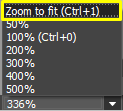
    ZoomToFit.png - the Zoom to fit function allows you to set the max scale for a selected page / popup.

    Icon Grid.png - the grid in workspace helps to allign graphic items with selected spacing

    Icon View Info2.png - select item properties in the workspace:

    • Show item names - display the item name on an item,
    • Show item borders - display borders of an item,
    • Show number of commands - display the number of commands assigned to an item.


    Guide Lines

    Guide lines are an additional tool to align items in a graphic interface of a project. They are almost the same as the grid, but the coordinates of each line are set separately.

    GuideLine.png

    Adding a guide line to a project:

    • to add a horizontal guide line to a project, drag the horizontal ruler (on the top of the window) to a required coordinate on the Y axis;
    • to add a vertical guide line to a project, drag the vertical ruler (on the top of the window) to a required coordinate on the Y axis;


    Coordinates of guide lines can be determined with the help of vertical and horizontal rulers. For a more precise determination of coordinates use cursor coordinates on the setting panel.

    Line.png


    Deleting a Guide Line in a Project:

    • select a required line with a cursor and delete it by pressing "Delete" on the keyboard;
    • select a required line with a cursor and delete it by pressing "Delete" in the menu of the right mouse button.


    Properties of Guide Lines:

    • Lines are displayed on all pages and popups of a project;
    • Graphic items align to guide lines with a side or the middle of an item;
    • Each guide line has its own editable parameters: Name , Coordinate, LineColor. These parameters are displayed in the PROJECT window (General tab) when a guide line is selected;
    • When a project is saved, all created guide lines and their parameters (coordinates, color) are also saved;
    • When i3 Pro is launched, guide lines are not displayed in the interface of a project.


    Menu of the right mouse button
    When the right mouse button is pressed in the ruler in the workspace, a menu opes with the following available functions:

    GuideLine2.png
    • Copy All Guides - copy all guide lines on the page;
    • Paste Guides - paste copied guide lines;
    • Delete all guide lines - delete all guide lines on the page.


    Dynamic panel

    A dynamic panel is a fact access panel to edit graphic items. The dynamic panel changes its parameters depending on a selected item, The parameters are divided into:

    DinamPanel.png

    1 General parameters of a graphic item (General):

    • X / Y- the coordinates of an item,
    • Width / Height - the size of an item,
    • Angle - the rotation angle of an item,
    • Name - the name of an item

    2 Additional properties of a graphic item.
    The additional properties of a graphic item are specific setting of each graphic item, settings of image and text on an item.

    See detailed description on additional properties in the description of tool bar.

    3 Setting states of a graphic item:

    • All sates - semultaneous setting of all states,
    • On / Off - choice of one of the states to edit,
    • Opacity - the transparency of an item,
    • Color - the color of an item,
    • Border - choice of a border for an item,
    • Border color - the color of the border.


    Tool bar

    The tool bar allows to create, choose and edit an interface item:

    DinamPanel4.png

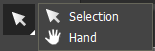
    1 Hand.png - Selection - select an item; Hand - move the workspace.

    2 Drow.png - draw an item

    Item type.png

    Read more about types of items in the " Types of graphic items, behavior in interface" article.

    3 WSettings.png - display General parameters of an item on the dynamic panel.

    DPanel2.png
    • Type (type of item) - determines the number of states and values that an item can send;
    • Feedback determiines if an item will change its state as a reaction to a user's actions, to receiving values from equipment or won't change its state at all;
    • Hit determines an area and the character of item hit;
    • Visible hides / shows an item on the page;
    • Active makes a button active / inactive. The button stop reacting to presses and is displayed in grey colors.


    Each type of graphic items has its unique parameters. Read more in the "Types of graphic items, behavior in interface" article.

    4 Image editor.png - show settings of item display on the dynamic panel.

    DPanel3.png
    • Select image - add an image to the item;
    • Delete image - delete an image;
    • Image stretch - stretch an image on the item:
      • none - keep the real size,
      • proportional - stretch an image proportionally to its initial size,
      • full size - stretch an image on the whole item;
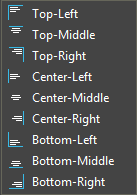
    • Image align - aligning an image;
    ImageAlign.png
    • Select icon - add an icon to the item;
    • Delete icon - delete an icon;
    • Icon stretch - stretch an icon on the item:
      • none - keep the real size,
      • proportional - stretch an icon proportionally to its initial size,
      • full size - stretch an icon on the whole item;
    • Icon align - aligning an icon;
    ImageAlign.png
    • Select chameleon - add a chameleon image to the item;
    • Delete chameleon - delete a chameleon image;
    • Chameleon stretch - stretch a chameleon image on the item:
      • none - keep the real size,
      • proportional - stretch a chameleon image proportionally to its initial size,
      • full size - stretch a chameleon image on the whole item.

    5 TextEditor.png - show text settings of an item on the dynamic panel.

    DPanel4.png
    • Font type - choice of a font;
    • Font size - choice of a font size;
    • Bold - bold type;
    • Italics - italics;
    • Text - text that will be displayed on an item;
    • Color - text color;
    • Text align - aligning text;
    • Word wrap - text wraping;
    • Effect - add an effect to the font;
    • Effect color - color of the added effect;
    • Show value in text - show Value in text.

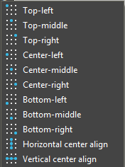
    6 Item position.png - item position on a page.

    IPos.png

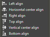
    7 Выравн2.png - item position on a page.

    Align.png

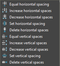
    8 Выравн3.png - an interval between items.

    Specing.png

    9 Выравн4.png - text align on an item.

    Text align.png


    Settings of Item Display (menu of right mouse button)

    The menu of the right mouse button is a set of tools to edit a graphic item fast and conveniently. To open the menu, slect an item with the left mouse button and then click the right mouse button in any place of the workspace.

    Workspace5.png
    Select.png
    Select item (Esc) - switch to the mode of selecting items.
    Draw.png
    Draw item (Ctrl + D) - switch to the drawing mode
    Copy.png
    Copy an item.
    Past.png
    Paste a copied or cut item.
    Clone.png
    Clone an item.
    Cut.png
    Cut an item,
    Delete.png
    Delete an item.
    Add.png
    Add (add to an item):
    • Image (an image),
    • Icon (an icon),
    • Text (text),
    • Sound (a sound),
    • Chameleon (a chameleon image ),
    • IP-Camera (IP-camera),
    • Link (a link to a browser page
      or a third-party app),
    • Script call (a script function).
    Delete.png
    Delete (delete from an item):
    • Image (an image),
    • Icon (an icon),
    • Text (text),
    • All sounds (all sounds),
    • Chameleon (a chameleon image),
    • IP-Camera (IP-camera),
    • All Links (all links to browser pages
      or third-party apps),
    • All script calls (all script functions),
    • All relations and commands (all relations and commands),
    • All changes (all changes).
    Order.png
    Order (order to draw items):
    • Bring to front - display on the foreground,
    • Sent to back - display on the background,
    • Bring forward - move forward by one item,
    • Send backward - move backword by one item,
    • Bring in front of... - move an item forward in relation to ...* ,
    • Send behind... - move an item backward in relation to ...* ,
    • Change places with... - change places with ...*.

    * After choosing a required parameter,
    click an item to which it will be applied.

    Lock.png
    Lock - lock an item in the screen in the current position.
    Unlock.png
    Unlock - unlock an item from its position on the screen.
    Hide.png
    Hide - hide an item
    Show.png
    Show - shoew a hidden item on the screen.
    Make transparent.png
    Edit / Make transparent - make an item transparent (Color Alpha Channel = 0).
    CopyStateStyle.png
    Copy/Paste style (copy / paste the style of an item):
    • Copy state style - copy the current state of an item except text ,
    • Copy style of all state - copy all states of an item except text,
    • Paste state style - replace the state of an item with a copied one.


    Project

    Project panel is a tool to edit the appearance of a graphic item (a page, a level, a button, etc.) in the interface. It is opened with the help of Project structure button on the right side panel. It consists of 3 parts: Pages and popups (a project tree), General (properties of a graphic item) and States (setting the display of states of a graphic item).

    Pages and popups

    A project tree (Pages and popups) allows to create new pages and popups.
    A page or a popup created in the project tree appears in the workspace of the editor.

    Pages&Popups.png
    Pages and popups:
    PP1.png Add page – add a new page.
    PP2.png Add popup – add a new popup.
    PP3.png Add folder – add a new folder.
    PP4.png Copy page – copy a page /popup.
    PP5.png Paste page – paste a copied page/popup.
    PP6.png Clone – clone a page / a popup.
    PP7.png Move up - move a page/ a popup/ a button up in the list.
    PP8.png Move down - move a page/ a popup/ a button down in the list..
    PP9.png Search - search in the project tree.
    PP10.png Project properties - project settings.
    PP Menu.png
    PP Project2.png
    Tools of the right mouse button:
    PP3.png Add folder – create a new folder.
    PP Add view.png Add view – add an alternative page orientation.
    PP1.png Add page – add a new page.
    PP2.png Add popup – add a new popup.
    PP Add item.png Add_item – add a new button.
    PP delete page.png Delete page – delete a page/a popup/ a button.
    PP4.png Copy - copy a page/ a popup/ a button.
    PP5.png Paste - paste a copied page/popup/button.
    PP add item to gallery.png Add item to gallery - add a page/a popup/a button to the gallery.
    PP Show popup on page.png Show popup on page - show a popup on the current page.
    PP rename.png Rename - rename a page/a popup/a button.
    PP Show usage.png Show usage - show relations with the item.
    PP Close project.png Close project - close the project.
    PP Create server project.png Create server project - create a server project.
    PP10.png Manager of popup groups - open the manager of popups.


    Read more information on creating pages and popups and navigation between them here.


    Control and Logic Tools

    Control of equipment and logic are available for both a panel project and a server one, as both projects can connect to equipment directly. But a server project has tools that are unavailable in a panel one. The following can be referred to control and logic tools:


    Drivers&Logic.png

    1. Drivers are a list of devices and services ti which i3 pro or iRidium server connect to control and get data (not all devices are displayed here, as it is possible to create drivers for devices and services via JavaScript).
    2. Programming (only for a panel project) are actions that a graphic object in i3 pro performs when it is pressed. Items can control the internal logic of the interface and send/display data received from equipment.
    3. Script - JavaScript editor is available for both i3 pro and iRidium server. During script development it is important to consider the environment, if it is a server or a visualization interface, as an environment determines a set of available tools to refer to data.
    4. Project tokens are variables where user data can be stores between starts of i3 pro or iRidium server.
    5. System tokens are variable that allow to get information about a device where i3 pro or iRidium server is launched (time, type, OS, network parameters, screen parameters, etc.).
    6. GC cloud are an on-line database of IR-commands to control audio-video equipment via IR. Commands are stored in the format of Global Cache equipment.
    7. Modules (only for a panel project) are on-line tool to add widgets (ready remotes) from i3 lite to a visualization interface for i3 pro.
    8. ETS import is import of group addressed from ETS5 project (*.knxproj).

    Logic and control tools for a server project:

    S Project.png

    1. Schedule is a schedule of events that can be set to happen at a certain time ot with a certain repetition period.
    2. Schemes are programming logic of iRidium server work with the help of logic blocks.
    3. Routines are routines (a sequence of commands and conditions for its launch), that can be launched by a schedule or an event.


    iRidium Studio Control Panel

    iRidium Studio control panel is a set of settings for the studio and a project.
    It includes:

    Настройки.png

    1 iRidium Studio Settings:

    • File - creating, opening/closing and saving a project,
    • Tools - studio settings (language, setting of item display in the workspace),
    • View - editing the location of tool bars,
    • Help - info about the app (version, documentation, technical support).

    2 Tools to set and control a project.

    3 Tools for testing and launching a project:

    • Emulator - the Emulator launches an interface from iRidium Studio in i3pro app on your PC. In a server project the Emulator launches a project from iRidium Studio in iRidium Server app on your PC in the Test mode;
    • Send to transfer - it sends an interfcae or a server project from iRidium stuido to a smartphone, a tablet or a server that is located in the same local network with your PC.


    Settings of iRidium Studio

    Commands that are available in drop-down lists File Project Tools Help View


    File

    New


    File New panel project.png

    File > New > New Panel Project
    (New Master Project) *
    * New Master Project allows to store all resolutions of an interface in one file.

    • Project Name - the name of a new project
    • Target Device - the type of the device on which the project will be launched (defines the project resolution). Select "Custom" to enter the resolution manually
    • Landscape Widht / Landscape Height - the resolution of the landscape page in pixels
    • Page Name - the name of the first page of a new project
    • Orientation - the orientation of the start page (Portrait/Landscape)
    File New server project.png

    File > New > New Server Project

      • Project Name - the name of a new server project
    Open Project Open a project saved earlier in the editor (*.irpz)
    Save Project Save a selected project (*.irpz)
    Save Project As... Save a project with another name
    Close Project Close a selected project
    Close All Projects Close all projects opened in the editor
    Reopen A list of projects that were recently opened. Click on a project to open
    Exit Close the editor an all projects opened in it. It will offer to save changes in projects.


    Tools

    Languages Choose a language of the editor interface
    Options


    Options2.png

    General settings of iRidium studio:

    • Emulator settings,
    • Workspace settings,
    • Settings of back-up copying,
    • Settings of item display in the studio,
    • Operations with files.


    Open settings: Tools > Tools > Options


    "Emulator" - settings of Emulator work in the editor

    ToolOptions1.png
    • Show log at Emulator start launches a log window (F4) at the same time with the app.

    Read more about settings of project logging and debugging here.


    "Workspace" - settings of item display in the workspace of the editor.

    ToolOptions2.png

    Information about an item in the workspace of the panel project:

    • Show item border - display borders of an item (specify the border color),
    • Show item name - display the item name on an item,
    • Show number of commands - display the number of commands assigned to an item.
    • Font - set parameters of the font that is displayed on an item by default (specify font and font size),
    • Element selection color - change the border color of the selected graphic item.

    Aligning items in the workspace of the panel project:

    • Snap to grid - attach graphic items to the grid,
    • Show grid - display the grid (select the color and the size of the grid),
    • Show guide lines - display guide lines in the workspace (select the color of lines),
    • Sticking to edge of popup - turn on sticking of graphic items to the page edge,
    • Alignment, relative to the last selected element (Ctrl) - turn on alignment relative to the last selected item. To align, select the required graphic items holding the Ctrl button (the last selected item will be the reference for alignment) and choose the type of alignment (step 7) (specify the border color of the last selected item).

    Other settings:

    • Show item in tree - display all items of a project (buttons, levels, etc.) in the project tree,
    • Show coordinate axes in schemes - display coordinate axes in the Schemes window in the server project,
    • Support of RTL languages - turn on the support of RTL to change the text direction from right to left (Arabic, Hebrew, etc).


    "Backup" - to set saving project backups.

    ToolOptions3.png
    • Backup - save / do not save backup copies of a project,
    • Backup path - a path to a folder where backup copies are stored,
    • Create backup each time project is saved - create a backup copy each time a project is save,
    • Create backup every... (sec) - create a backup copy evey... (sec),
    • Delete backup older than... (days) - delete backup copies that are older than... (days),
    • Number of backups - the number of stored backup copies,
    • Force backup - forced backup copying,
    • Restore from backup - restore s project from a backup copy,
    • Open folder with backup of currect project - open a folder with baclkup copies of the current project,
    • Open backup folder - open a folder with backup copies,
    • Delete currect project backup - delete the current backup copy of the project,
    • Clear backup folder - clear the folder with backup copies.


    "Project style" - settings of the project style (color, font and other parameters of items by default).

    ToolOptions4.png

    Fonts - the size of the font on the folowing items:

    • Page,
    • Window,
    • Item,
    • Label.

    Page - page parameters:

    • Page color - the color of a page,
    • Page border - the border of a page (style, color),
    • Text alignment - text align.

    Window - window parameters:

    • Window color - the color of a window,
    • Window border - the border of a window (style,color),
    • Text alignment - text align.

    Button - parameters of a button:

    • Create manually - default text on an item,
    • Create from command - a format to display text on an item when a command/a feedback channel is drag'n'dropped to the workspace:
      • Driver name. Command name - display the name of a driver and the name of a command/feedback channel,
      • Command name - display only the name of a command/feedback channel.

    State 1/State 2 - buttons display settings:

    • Item color - color of the item,
    • Item border - borders of the item (style, color),
    • Text alignment - alignment of the text.


    "File operations" - creation of animated items.

    ToolOptions5.png
    • Separator to create animated items from a group of images - a separator to create animated items from a several images.
    • Path to Documents folder of Studio - select a path to a folder with documents of studio.


    "Script" - settings of the Script Editor.

    ToolOptions6.png
    • Tab size - the number of blank spaces that appear when the "Tab" button is pressed.


    View

    Lock panels lock the position of editor windows.
    Unlock panels Editing the position of editor windows.
    Reset window layout Reset the position of windows to the standard one.


    Help

    Editor Help iRidium Studio user manual.
    Update Editor Checking for editor updates. Updates change the editor and accompanying applications. The settings stay the same.
    Send Bug Report Send a repot about found bugs to the technical support portal.
    About Information about the editor version.

    Tools to set and control a project

    Menu Down.png
    Cancel the last action done in the graphical editor.
    Menu Up.png
    Retunrn the cancelled action in the graphical editor.
    Menu Folder.png
    Open a project.
    Menu Save.png
    Save the current project.
    Menu Relations.png
    All relations used in the project.
    Menu Settings.png
    Project setting.


    HOTKEYS

    Hotkeys are a tool of fast access to different featues of iRidium studio.

    • Ctrl + N - a new project.
    • Ctrl + O - open a project.
    • Ctrl + F4 - close a project.
    • Ctrl + Shift + F4 - close all projects.
    • Ctrl + S - save a project.
    • Ctrl + Shift + S - save a project as...


    • Ctrl + Z – undo the action
    • Ctrl + Shift + Z – redo the action


    • LEFT MOUSE BUTTON – select an item
    • RIGHT MOUSE BUTTON – go item properties
    • Ctrl + C – copy an object (a group of objects)
    • Ctrl + X - cut an object (a group of objects)
    • Ctrl + V – paste an object (a group of objects)
    • Ctrl + A – select all objects on the page


    • Ctrl + G - group selected items.
    • Ctrl + Shift + G - ungroup selected items.
    • Alt + G - enable / disable the display of the grid in the workspace.


    • Ctrl + Left Mouse Button - select several objects.
    • Shift + Left Mouse Button + Move - clone an object on the page.
    • ← ↑ → ↓ buttons - move a selected object in the workspace (with 1 pixel step).
    • Ctrl + ← ↑ → ↓ buttons - move a selected object in the workspace (with 10 pixel step).
    • Shift + ← ↑ → ↓ buttons - increase/decrease the size of a selected object (by 1 pixel).
    • Ctrl + Scroll - increase/decrease the size of the workspace.


    • Ctrl + Shift + F - open a window to search in all scripts of the project.


    • F2 - opens a popup to edit text of the current item (it also changes names in the project tree and the driver tree).
    • Space
      • When selecting a graphic item, it changes the state of the current item (one after another).
      • When selecting the Workspace, it calls the Hand tool to move in the Workspace.
    • Page Up, Page Down - changes the state of the current item (previous, next).
    • Shift + Home - select all text before marker.
    • Shift + End - select all text after marker.
    • Shift + Left arrow - select one character before marker.
    • Shift + Right arrow to select one character after marker.


    • F4 – open the log of the Emulator/iRidium App for Windows
    • F5 – launch Emulator
    • F8 – open the settings of the Emulator/iRidium App for Windows


    • Hold L - draw a label in the workspace.
    • Hold B - draw a button in the workspace.


    • Ctrl + + - scale up project.
    • Ctrl + - - scale down project.
    • Ctrl + 0 - set project scale by default.
    • Ctrl + 1 - set the max scale for a selected page / popup.
    Источник — «https://dev.iridiummobile.net/index.php?title=IRidium_studio_2019_Editor_Settings/en&oldid=138193»
    About us
    Company
    Team
    History
    Philosophy
    Rewards
    Partnership
    Our partner
    Partnership Programs
    Apply for partnership
    products
    iRidium pro
    iRidium lite
    iRidium gate
    iRidium server
    Loads
    iRidium pro
    iRidium lite
    Other version
    Marketing materials
    Support
    On-line courses/Video
    Recommended equipment
    Other version
    iRidium pro
    Documentation
    FAQ
    Forum
    iRidium lite
    Documentation
    Forum
    Projects
    Standart projects
    Smart buildings
    Smart house
    Special solution
    Find a dealer
    News
    Youtube
    Twitter
    VK
    Logo
    contact@iridi.com
    +7 (499) 322-73-29

    Privacy policy